
TREND 3
Outside the Grid
Designers have been locked into frameworks, like Bootstrap, for too long. Many are starting to look for alternate ways to design and code.
Which one of these two websites are you designing?
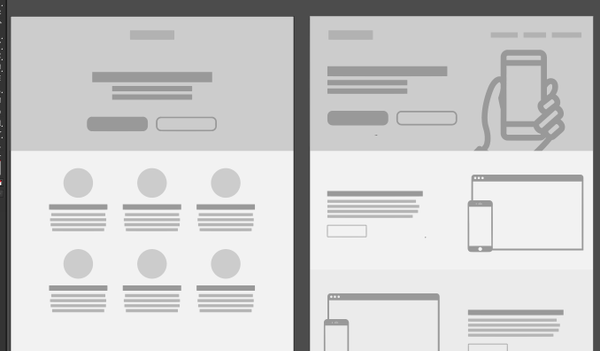
It's sad, but it's true. Any web designer that's been doing work the past few years has designed something that looks eerily like this. I won't lie either - this eBook, created in ion interactive, is based off a boot strap grid and is built without anything to really break it out of that.
Bootstrap is convenient. It's great for prototyping, and even building sometimes. But it is holding us back in many ways. When I attended An Event Apart in Orlando in October of 2016 I heard one thing from many of the presenters - we're bored of seeing (and making) the same design over and over again.
I'm starting to see more websites break out. With Microsoft dropping support for IE8 (finally!), CSS grid starting to make its way out, and more and more designers realizing that bootstrap isn't as restrictive as we always make it out to be, this is going to be an interesting year for us.
We can’t trust the data. And those who do will always be stuck chasing a robotic approach to human connection.
- TRAVIS GERTZ, DESIGN MACHINES3
Did you know?

Is CSS Grid currently
supported in
any modern browsers?
Currently, CSS Grid is not natively in any browsers as it is currently in development. Manufacturers seem to be holding off until the spec is complete.4
What famous social
media company created
Bootstrap in 2010?
Bootstrap was created at Twitter in mid-2010 by designer Mark Otto and developer Jacob Thorton. Prior to being an open-sourced framework, Bootstrap was known as Twitter Blueprint.
What popular way of
coding for web is still
used for email coding?
Table layouts, popular for a long time in the late 1990s and early 2000s, are still utilized in code for email clients, making the design of these different for designing for web.
What can we do?
If you are like me, you are sitting there wondering 'yes, great, the web is boring, a new code is something out to make the grid something other than 12 columns but who knows when that's going to happen, and when it does, my company isn't going to approve that for awhile.' I hear you. And my thought is - you can go outside the grid in bootstrap. You just have to get a bit creative with your design and your code.
At my job at ion interactive, I deal with a variety of types of projects. From projects where I have complete creative freedom with a client to clients who have designed a flat design without a single care for the grid. In most cases, we are challenged to create something very different while still utilizing our grid as building blocks. This is where I can find the beauty in things built with a framework. We may use a 12 unit width, full screen column to contain an image that we utilize media queries and a variety of percentage based positionings to layer pins over a map, like in the UBM Geek's Guide to London. Another example is in this FPL Infographic where we got creative with some negative margins and positioning to give the images a more natural, flowing feel than being contained strictly to within the column space.
Don't get boxed in by the grid, but think of the grid as a challenge instead. Design something and think 'how could this come to life?' and do it. I see more and more of this happening on the web looking for inspiration - the light is near.